PROJECT SUMMARY
I led the prototype design and the usability evaluation of this project for an improved accessibility checker in PowerPoint. During usability evaluations, participants were able to address 95.5% of the accessibility issues.
TEAM
Junyi Zeng (Lead UX Designer)
Tymirra Smith (PM)
Lukas Schmid (UX Researcher)
Irene Ong (UI/UX Designer)
MY ROLE
User Research
Prototyping
Usability Testing
Interaction Design
DURATION
Aug 2021 - Dec 2021
THE PROBLEM
Course materials are often inaccessible to students with visual impairments (VI) at Georgia Tech and across U.S. universities.


THE SOLUTION
Guided Tutorial and Interactive Issue Overview
Helps new users understand what accessibility issues are.
Demonstrate the auto-generated alternative text and hyperlink text feature in the tutorial.
A pop-up modal provides users with an overview of accessibility issues when hovering over the icon, offering the option to toggle the visibility of these issues.


THE SOLUTION
Visualized Accessibility Solutions Workflow
A pop-up modal will show users an overview of the accessibility issues they have.
Improve the usability of this icon by adding information and promoting a smoother, uninterrupted workflow.
Slide indicators will provide users with precise guidance without opening the sidebar.


THE SOLUTION
Smart-evolving Autogeneration Assistant
Automated issue resolution:
Missing text (such as titles and alt text) will be autogenerated.
Enable applying titles/alt-text to multiple pages/images with just one click.
The system will record users’ preferences to generate better suggestions.
Provide users with static examples and explanations for each type of issue.


PRIMARY RESEARCH
Competitive analysis has revealed that:
PowerPoint is the most popular course material generator and accessibility checker.
Other tools require too much effort because users need to switch between different platforms (sometimes a subscription is required).
The accessibility checker in PowerPoint is not helpful enough because:

USER RESEARCH
We conducted contextual inquiries with visually impaired students, along with surveys and interviews with professors.
📝 Survey

n=67 professors at Georgia Tech
Measure professors’ willingness to make materials accessible and their expectations.
✍ Contextual Inquiry

n=2 students with VI at Georgia Tech
Understand the problems that inaccessible course materials pose for students with VI.
💬 Semi-structured Interview

n=7 professors at Georgia Tech
Comprehend the requirements and current approaches of professors in making materials accessible.
PRIMARY RESEARCHKEY USERS
Focused on professors, two personas were created:
the Dedicated & the Busy.
In this phase, we identified a gap in professors' awareness of creating accessible class materials for students with visual impairments.
Currently, at Georgia Tech, students bear the responsibility of reaching out to certain departments to ensure accessibility, placing an additional burden on students to navigate the process independently.
By engaging professors in this initiative, we aim to alleviate the pressure on students, enhance accessibility, and foster a collaborative approach to making course materials widely inclusive.


MAIN INSIGHTS
The accessibility checker should be compatible with mainstream slide generators and also easy to use by people without visual impairments.
📈 EFFICIENCY
Efficiency should be a priority.
Professors are inclined to make course materials accessible if it is quick and easy.

💪 CONFIDENCE & A SENSE OF CONTROL
Professors are willing to spend as much time as needed to ensure that their slide content is engaging and informative.
Professors want to feel confident and in control of their materials.

🎯 EASE OF USE
Accessibility solutions should provide more convenience and accessibility for people without visual impairments.
Professors will prefer easy-to-use systems with tutorials.


HOW MIGHT WE…
Design an easy-to-use system to help professors streamline the process of making course materials accessible with confidence and efficiency?
USE CASES
According to our research, the main use cases are:
creating new slides & updating existing slides.

IDEATION
I led the brainstorming session and generated 3 design ideas:
Utilized key insights to derive design implications.
Initiated the brainstorming process with prompts (e.g., improving efficiency in solving accessibility issues) as foundational concepts.
Expanded and refined each design concept through internal presentations and discussions to achieve high-quality solutions.
To broaden our exploration of design possibilities, we also delved into designing for other mainstream platforms, such as Canvas.
Concept 1: PowerPoint Plugin - AccessGUIDE
A re-design of the accessibility checker in PowerPoint.
Provide a summary of identified accessibility issues which are classified by severity.
Guide users to fix accessibility issues.
Offer one-click solutions to fix accessibility issues.
Most-commonEasy to incorporate


Concept 3: Service design - AccessCORPS
A web-based system that helps users organize multiple types of files.
Users can access an organized gallery of files made accessible by AccessCORPS for easy reuse.
Customize a list of recommendations and ways to avoid common accessibility issues.
Easy to updateOrganized systemFamiliarityCustomizable

Concept 2: Learning management system (LMS) Plugin
An add-on to existing web-based systems like Canvas.
Generate accessibility scores for files uploaded, offer detailed error breakdown, and flag major errors.
Option to review and accept auto-corrected minor errors.
Enable one-click updating of files for effortless distribution to students.
Easy to updateFamiliarity

CONCEPT FEEDBACK SESSIONS
After receiving feedback on 3 concepts, the consensus is that a PowerPoint plugin aligns most effectively with the users' needs.
The choice of the PowerPoint plugin is supported by unanimous participant preference and willingness to use the design.
Three key features contribute to this preference:
Alignment with PowerPoint's layout
Seamless guidance for issue resolution
The ability for professors to maintain control over their slides
Additionally, the convenience of saving updated slides directly to the users' preferred storage location distinguishes the PowerPoint plugin from the other concepts, which would necessitate additional steps for downloading and storing updated files.

ITERATIVE DESIGN
3 major improvements in this plug-in redesign:
1. Guided Tutorial and Interactive Issue Overview
Before Accessibility Checker Help

After AccessGUIDE Tour

After Visual Indicators

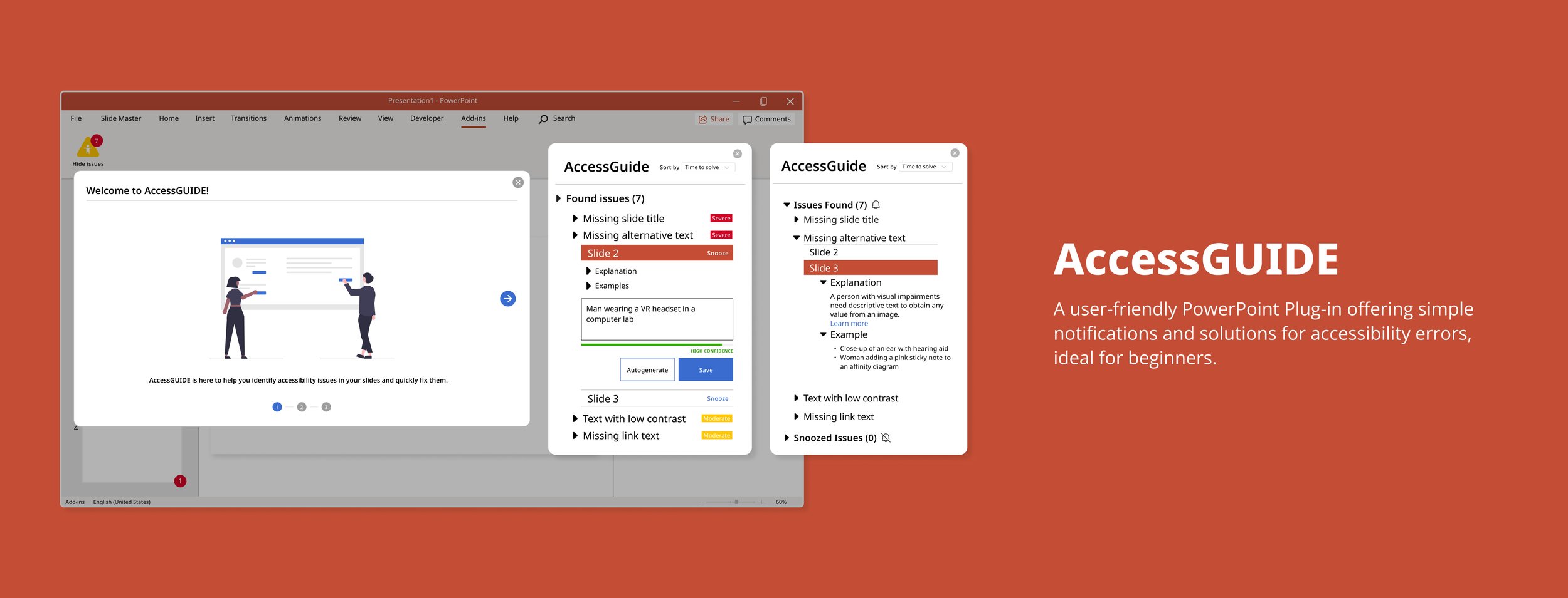
The pivotal enhancement in AccessGUIDE lies in the introduction of the Onboarding Tour Guide. Recognizing the limitations of the original Accessibility Checker's text-heavy "help page," our discovery research illuminated the need for a more user-friendly guide to navigate accessibility issues confidently.
Overview Pop-up: Through an iterative design process driven by invaluable feedback, we refined the initial help page. The first iteration solely displayed the number of accessibility issues, leading users to seek assistance. In response, we introduced a pop-up offering a comprehensive overview of accessibility issues before users entered the sidebar.
Welcome Tutorial: Rather than relegating the "help page" to the lower level, we brought it to the forefront of the plugin. AccessGUIDE now features a full-screen, image-based tour upon opening, guiding users through common accessibility issues and optimal tool usage. This strategic approach ensures a seamless onboarding experience, acquainting users with the fundamental aspects of using the plug-in.
In response to: 🎯 EASE OF USE • 💪 CONFIDENCE & A SENSE OF CONTROL
2. Visualized Accessibility Solutions Workflow
Before List View of Issues
3. Smart-evolving Autogeneration Assistant
Before One-size-fits-all “Explanation”
After Customized Autogenerated Solutions / Solve in Bulk / Snooze

The second highlighting feature, incorporating the 'WAVE' icon, directly addresses user feedback for more precise slide guidance. This improvement significantly streamlines navigation and usability, enabling users to locate and rectify issues efficiently.
Enhanced Navigation: The addition of the 'WAVE' icon offers users a clear and immediate connection between issues in the sidebar and their corresponding slides, improving overall navigation.
Efficient Issue Preview: The new pop-up functionality upon hovering over the 'WAVE' icon allows users to quickly grasp issue details without the need to open the sidebar, contributing to a more streamlined and user-friendly experience.
In response to: 🎯 EASE OF USE • 📈 EFFICIENCY
After Explanation & Examples


The third significant enhancement involves automatically generated solutions for addressing accessibility issues. Our research revealed that users often lack familiarity with such issues, leading to a lack of awareness about how to resolve them. Through the automatic generation of alternative text, titles, and other pertinent content, users can effectively address accessibility issues with confidence.
Auto-generated Suggestions (Enhanced Confidence Indicators): Users now benefit from a confidence indicator when utilizing auto-generated solutions, addressing initial distrust. Clicking 'auto-generate' reveals the confidence level, empowering users to choose whether to regenerate or apply the changes. The system evolves, learning from user preferences to offer better suggestions.
Solve in Bulk (Apply to Multiple Slides): Efficient Slide Management: Catering to diverse presentation styles, users can now group slides into categories for bulk actions. The 'assign title to multiple slides' option streamlines the process for professors who prefer narrative-style presentations, allowing for quicker and more intuitive slide organization.
Snooze and Address Later: Temporarily Ignore Moderate Issues: Responding to feedback, the 'Snooze' feature allows users to temporarily hide 'WAVE' icons from slides with moderate issues. This enables quick modifications before a presentation, emphasizing efficiency. The unchanged issue count serves as a helpful reminder to revisit and address the snoozed issues.

Our user research revealed a lack of familiarity among our users regarding accessibility issues in PowerPoint. Users now have the option to click and toggle examples and explanations open or closed at their convenience. To strike a balance between minimizing sidebar clutter and offering comprehensive information for users seeking to delve deeper into accessibility issues, we've integrated deep links to external accessibility resources.
In response to: 🎯 EASE OF USE • 📈 EFFICIENCY • 💪 CONFIDENCE & A SENSE OF CONTROL
HIGH-FIDELITY PROTOTYPE
Design System


USABILITY TESTING
Participants were able to effectively address 95.5% of the accessibility issues, with confidence.
To evaluate this prototype, we conducted a remote moderated task-based usability study with 6 participants (Georgia Tech professors). This was followed by a questionnaire that helped us identify where the prototype lies on a usability spectrum.
Here is a brief overview of the method:
Explain the purpose of the study and the think-aloud method
Ask participants to perform benchmark tasks one by one
Ask follow-up questions after each task regarding what went well, what did not
Ask participants to finish the follow-up questionnaire in the chat
Iterate designs based on new insights
We gathered a mostly positive response to the prototype. Participants were able to perform the benchmark tasks with ease, and the SUS questionnaire allowed us to obtain quantitative data about user's thoughts while using the app.
Here are a few highlights from the results:

REFLECTION
Lessons learned…
Challenges:
Obtaining data from the target user group posed a significant challenge, resulting in limited diversity in sample sizes.
Relying heavily on professors within the MS-HCI program at Georgia Tech may have skewed the data.
Balancing collaboration during the design process with meeting deadlines proved challenging.
What went Well:
Effective communication within the team, highlighted by regular group retrospectives after each project deliverable.
Project management strategies, including looking ahead at assignment deadlines and setting internal task deadlines, contributed to successful time management.
Distribution of tasks based on individual strengths facilitated the creation of high-quality deliverables.
What could be done differently:
Allocate more time for developing the prototype and testing protocol for usability feedback sessions.
Starting the design process earlier would allow for the addition of necessary interactions to the prototype.
Emphasize more time on the research and brainstorming phases to avoid rushing through these steps due to assignment deadlines.